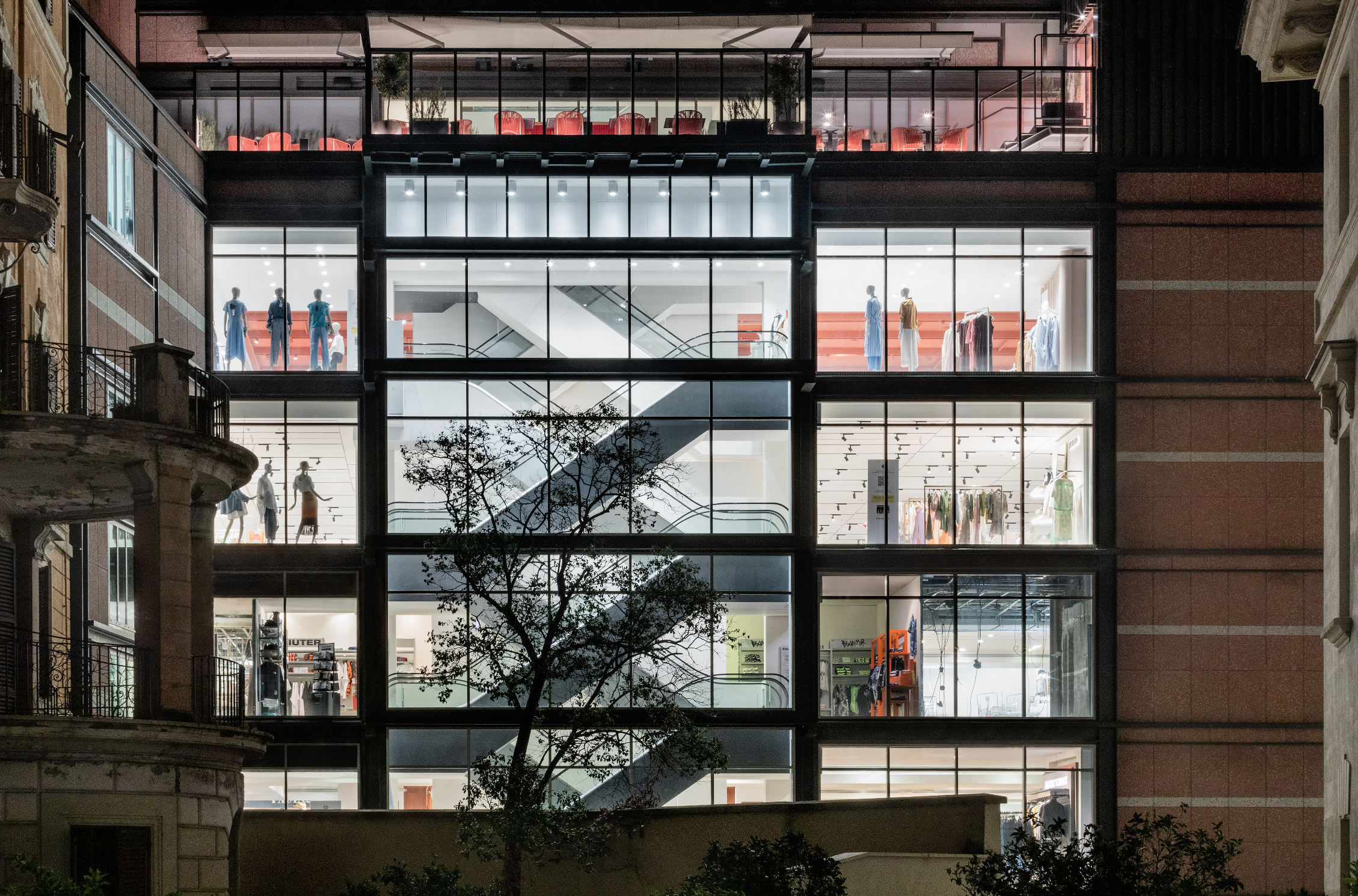
Cover photo: Use of warm lights in The Neon Demon (2016) | Amazon Studios
Colour in film can act as a vehicle for expressing the emotional tone of a sequence while also establishing the overall mood of the story unfolding on screen.
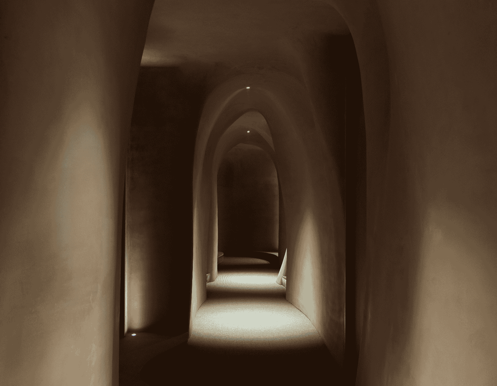
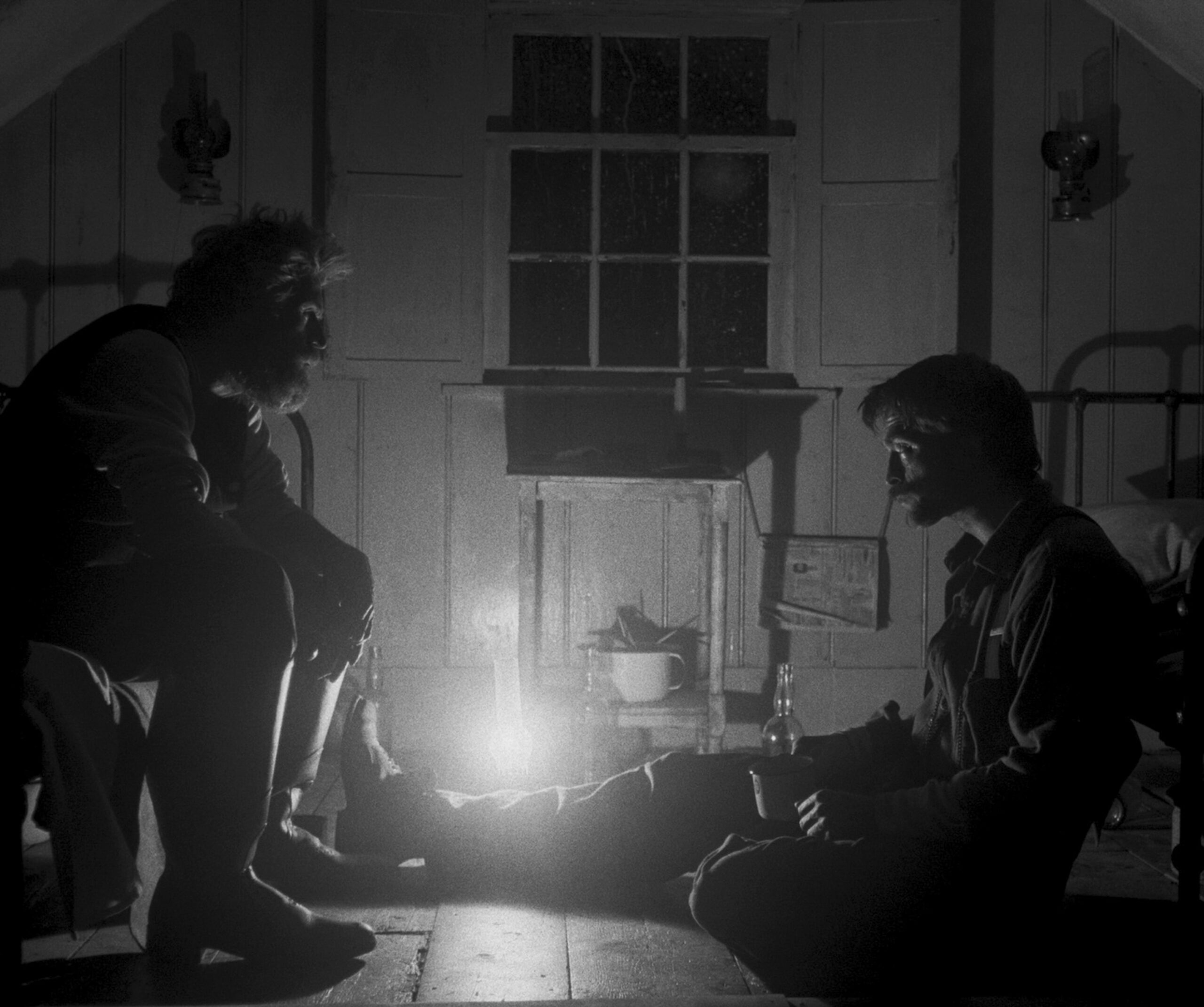
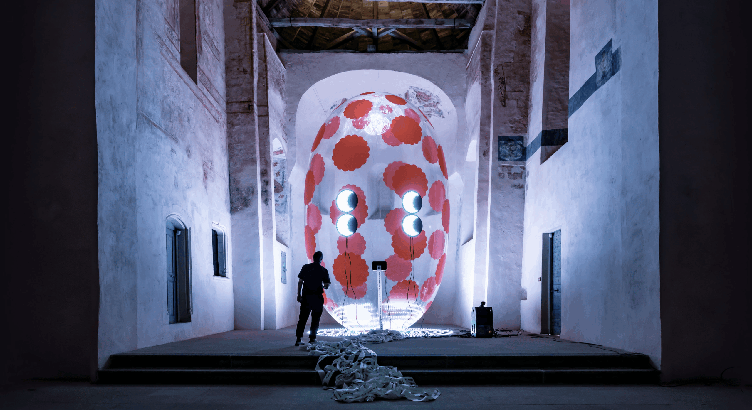
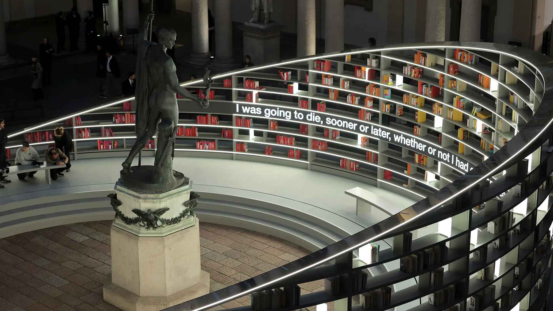
The way a tone appears on the big screen depends mainly on the control of light: through the alternating use of warm and cool lights, directors, with the skilled hands of cinematographers, add an artistic layer to the audience’s experience.
In this article, we’ll explore a few iconic examples from modern and contemporary cinema to understand how these chromatic choices influence cinematic storytelling.
Chandeliers in cinema are more than just set pieces; they activate concepts—like luxury, power, or drama. Sometimes, they are masterpieces of design, elements of a grand machine crafted to evoke the sense of wonder cinema has pursued since its inception. We can view them as part of the scenery and a point where cinema, history, and art converge.
Warm Lights, Cool Lights, and Color Palettes Across Film Genres
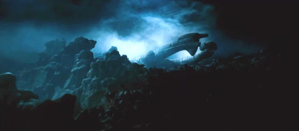
Film genres have long been strongly defined by the use of warm and cool tones. In horror films, for example, cool lights are often used to create a sense of tension and fear, amplifying the atmosphere of uncertainty and imminent threat. Scenes bathed in cold blue or green hues (Alien, The Shining) evoke feelings of isolation and danger, making the environment hostile and alienating through neon lamps or high-temperature lighting.
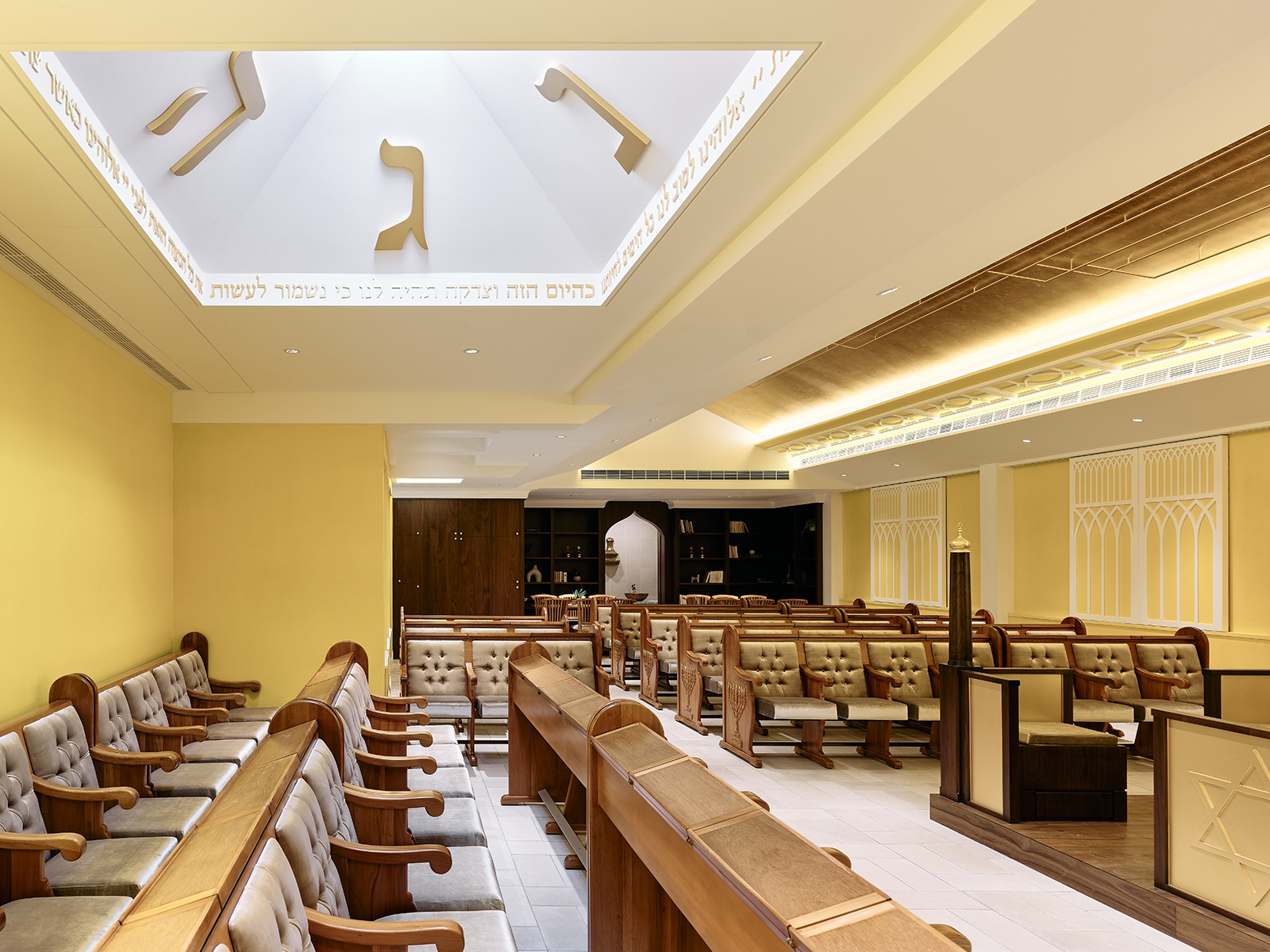
In contrast, romantic dramas and comedies often use warm lights to evoke feelings of intimacy, joy, and comfort.
These golden and orange tones help create cosy and familiar settings where characters exist in emotionally safe spaces. Technically, such lighting is achieved with incandescent bulbs or LED lights with colour temperatures around 2700-3200K.
In the science fiction genre, distinctive use of colours is also noticeable: cool lights often dominate, reflecting a cold, technological future (2001: A Space Odyssey, Blade Runner), while warm tones are used for humanising moments of connection between characters or highlight natural elements contrasting with a hyper-technological world.
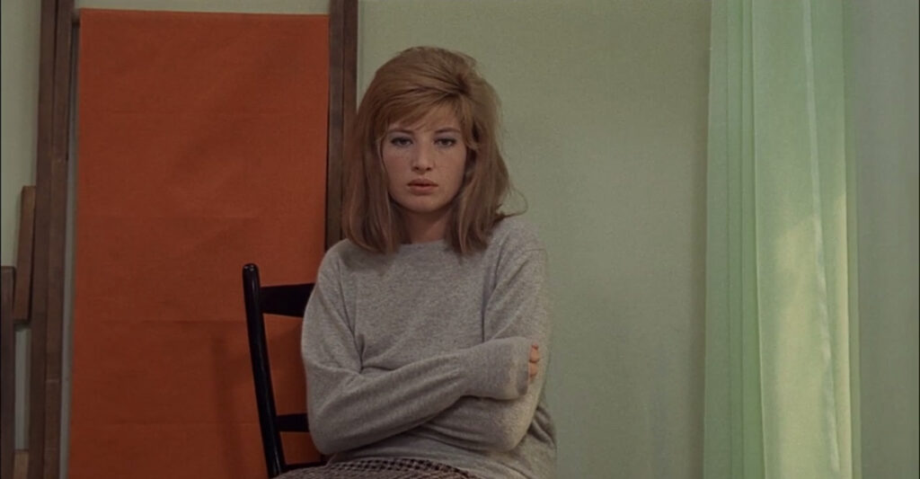
Cool Lights in Michelangelo Antonioni’s “Red Desert”
Color played a pivotal role in the visual culture of the 1960s, a decade marked by a vibrant explosion of color across media landscapes. It was the era of Andy Warhol and psychedelic culture, with Michelangelo Antonioni’s Red Desert standing as a prime example of its influence.
In Red Desert, the industrial landscape, dominated by grey factories and opaque skies, is frequently bathed in cool lights, emphasizing the dehumanization of the world surrounding the protagonist, Giuliana.
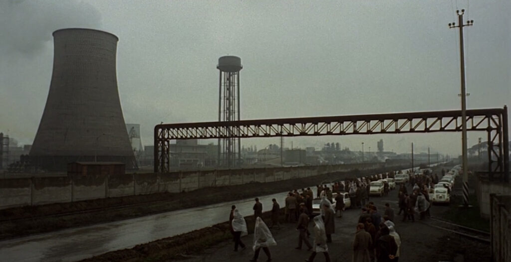
The selective use of warm light in a few scenes creates a striking contrast, underscoring Giuliana’s profound disconnection from the world and herself. Antonioni revealed that for this film, he had «committed to exploiting every narrative possibility contained within the colors» so that they «find harmony with the spirit of each sequence, of each individual sequence».
The Use of Warm and Cool Lights in Contemporary Cinema
In contemporary cinema, the use of warm and cool lights has evolved, becoming more sophisticated and complex. The possibilities offered by digital image manipulation have expanded the narrative potential of lighting into unexplored territories.
One particularly striking example is from director Nicolas Winding Refn, who, in The Neon Demon, plays with the contrast between blue and red, between cool and warm tones. In the film, the shift between these two colours marks the protagonist’s transformation, taking her from naive girl to Narcissus, semiotically symbolizing the contrast between stillness and movement, between water and fire, between safety and danger, between the negative-cool and affirmative-warm colours.

