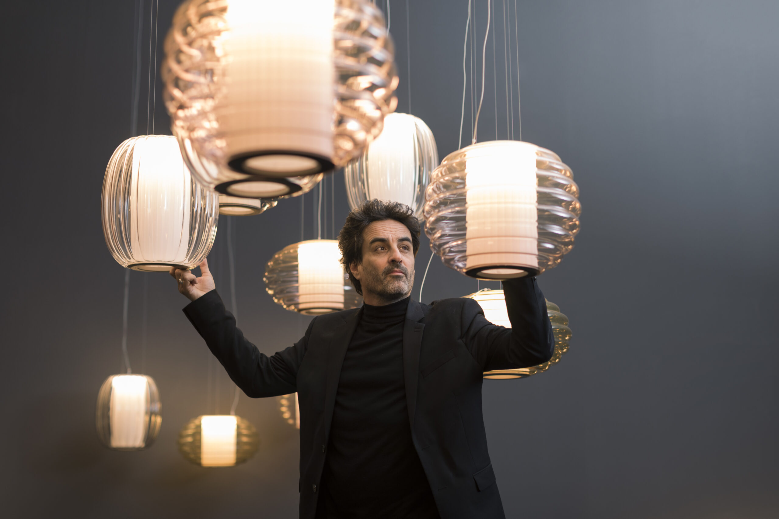
Cover photo: Andrea Isola, ph. Rafael Arocha
With a background in architecture, Andrea Isola has been working in exhibition design since 2018. Over the years, he has collaborated with museums, foundations, fairs, and galleries across Italy and Europe. We spoke with him about museum lighting and explored some of his most recent projects.
When you first step into a space, how do you approach it, and what key aspects do you consider?
«The first thing I do is walk through space. I try to identify its strengths, the optical angles to leverage, and how natural and artificial light interact. I immerse myself in the ambience as if I were a visitor, focusing on the physical experience in the space: this helps me form a clearer idea of how to design the exhibition path. I believe that only by putting yourself in the shoes of the spectators can you truly understand the positives and negatives of a layout. For this reason, I regularly visit exhibitions throughout the year.
Another essential step during the initial visit is asking the owner or manager as many questions as possible that can range from: «Can we drill into existing walls?» to «Is it possible to integrate additional lighting?» or «Where does the power come from?». This is especially important because, in many cases, I only get one chance to enter the space before construction begins. I use that moment to resolve doubts during the design phase and avoid future delays».
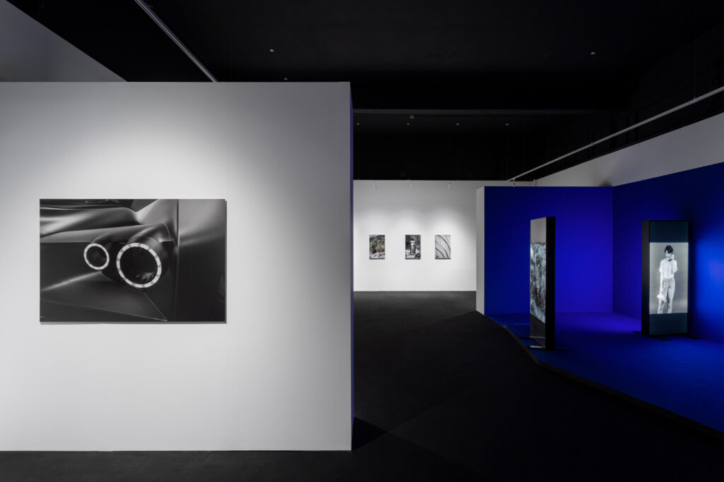
Let’s talk about the “white box” type of exhibition space—a large, minimal room with primarily cold artificial lighting. How can you transform it?
«A white box is like a blank canvas that can be adapted even with low-cost solutions. Two key elements are the use of colour and lighting. Darkness and shadows, for example, create voids, drawing the eye toward the light source. This suggests that visitors can often be guided through a space simply by adjusting the spotlight angles, removing the necessity for any walls or other physical barriers that could exceed the budget.
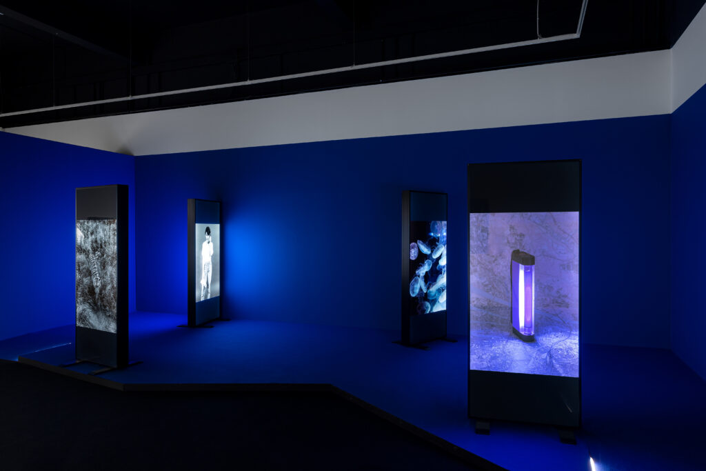
Two examples of white box exhibitions I designed in the past year are Heatwave and Voci Nascoste, both at Camera Torino in different rooms. In Heatwave, we had wall-mounted photographs alongside freestanding lightboxes. To harmonize these elements within the same open space, we chose to illuminate one section with spotlights directed at the photographs on white walls, while the rest of the space was treated differently: the walls and floors were painted deep blue, and the lights were deliberately kept off, making the artworks stand out more.
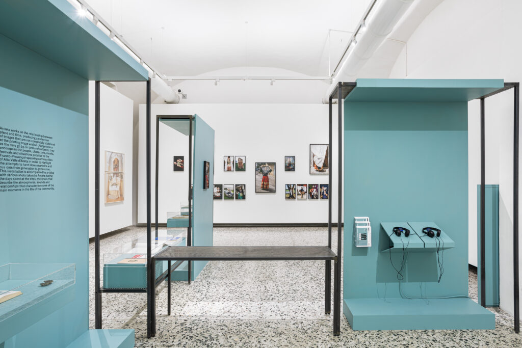
In Voci Nascoste, on the other hand, the goal was to create uniform lighting for a great number of artworks displayed on both the side walls and the centre of the room. The central freestanding walls, custom-designed for the exhibition, were positioned to ensure proper lighting and to avoid casting shadows on the existing side walls».
What about spaces with more character, like galleries or historic buildings with intimate, warm lighting and limited layouts?
«In these cases, the design constraints are bigger, which raises the level of challenge and complexity. However, having such boundaries can sometimes be a strength.
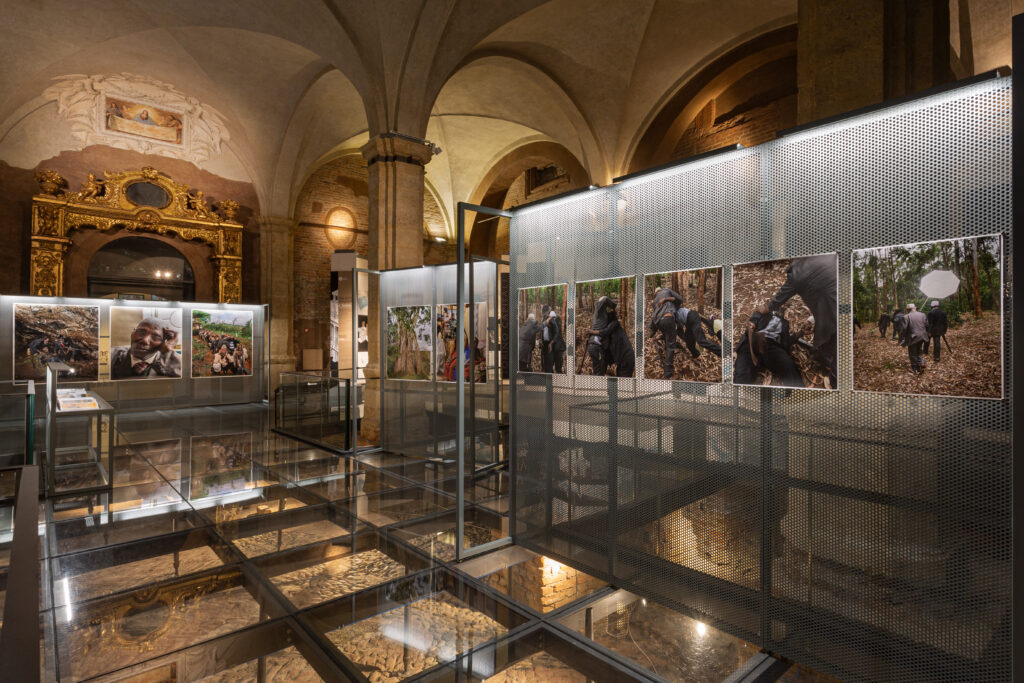
One challenging project was State of Emergency in the Medieval Court of Palazzo Madama, Turin—a stunning but complex location with high ceilings and glass floors revealing the remains of the city’s Roman walls. The design had to strike a balance between not overwhelming the space and ensuring the installation did not disappear amid the beauty of the setting. The artist and curator envisioned a “historical archive” ambience, inspiring the design of metal grids with integrated cool lighting to evoke the distinctive atmosphere of an archive.
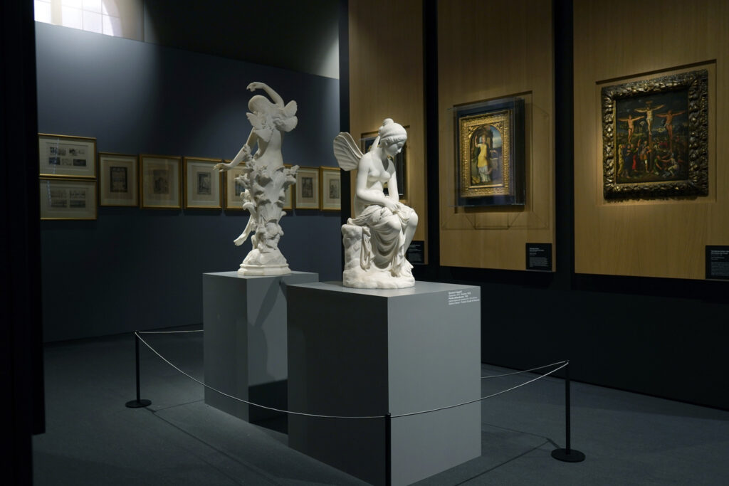
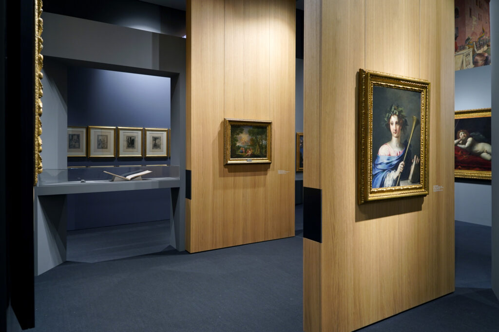
Another example is Psiche allo specchio. Omnia vincit amor at La Galleria BPER in Modena. This contemporary space required a layout incorporating ancient, modern, and contemporary works in various media—paintings, sculptures, etchings, and more. Given the existing lighting system, carefully aiming the lights was crucial for the exhibition’s success.»

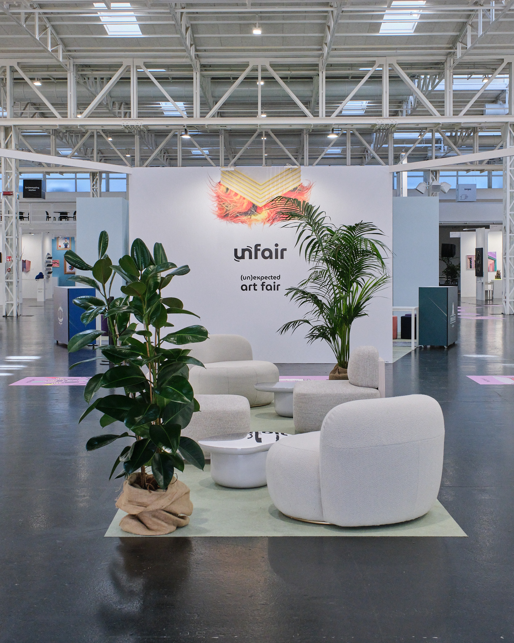
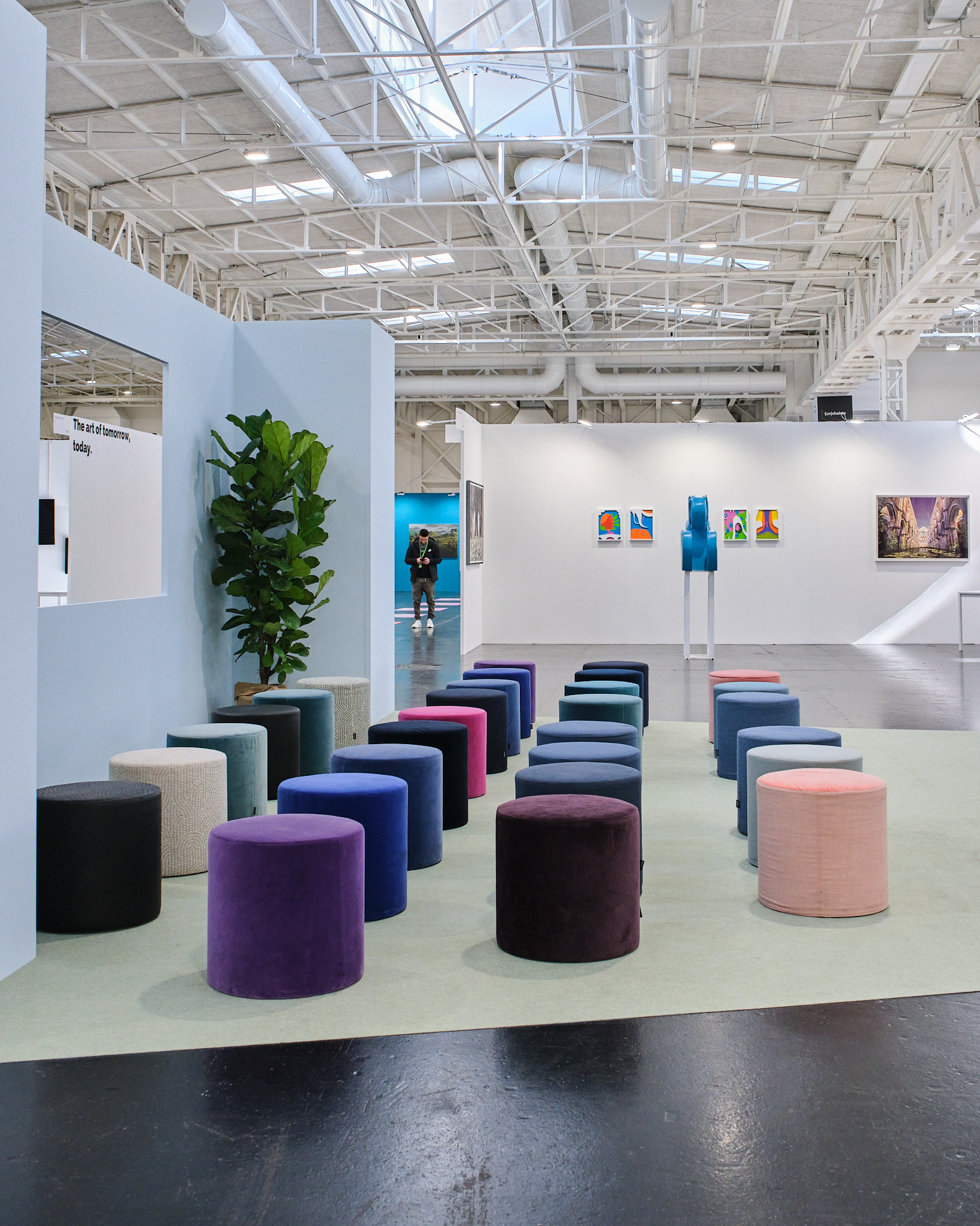
You also design for fairs, dividing spaces into various stands and areas. What principles do you follow in these settings?
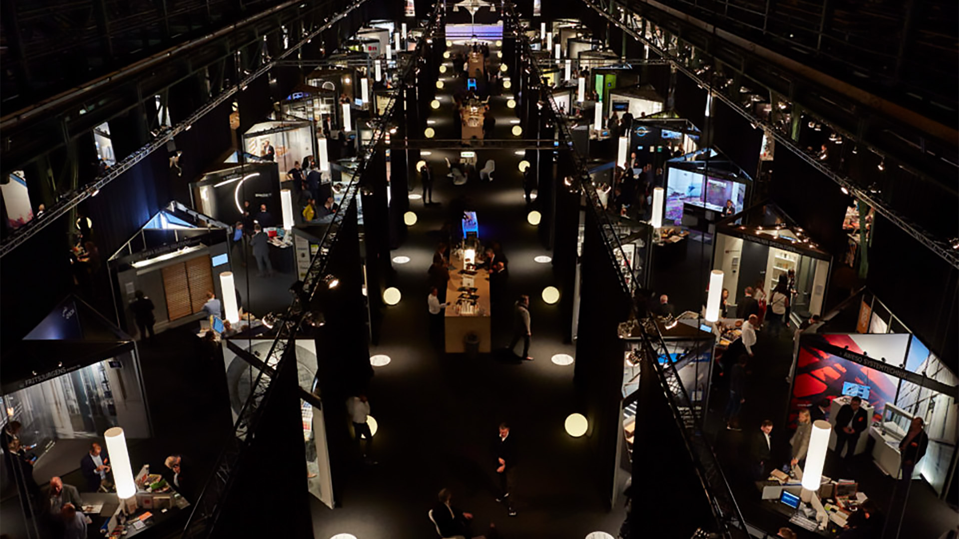
«Designing for a fair is a months-long process involving close collaboration with the staff. Initially, I created a layout outlining the main structure and visitor pathways, dividing the space into areas for galleries, relaxation zones, and more.
Once the stand types and sizes are defined, I delve into the details: drafting specifications for wooden panels, planning the lighting system, and coordinating construction phases. As with exhibitions, I focus on putting myself in the shoes of visitors and clients (the gallerists), asking questions to ensure the spaces are practical and functional».
Can you share examples of how you have used lighting differently to highlight traditional artworks, like paintings or sculptures, versus digital interactive works?
«I always say that the exhibition design should serve the true stars of the show: the artworks. Lighting, therefore, must follow this principle.
For instance, some works, especially in contemporary art galleries, are best illuminated with diffused light, avoiding direct exposure. Ancient artworks, on the other hand, often require precise lighting with controlled lux levels to prevent damage to fragile materials.
For sculptures, playing with light and shadow is essential to emphasize their three-dimensionality, curves, and intricate details. Digital artworks, such as backlit pieces, lightboxes or video art, usually require darkness to glow. Direct lighting is prevented to ensure that these works are enjoyed at their best. Each piece requires its lighting approach, and when existing systems cannot be modified, we try to compensate in some way to exalt their unique qualities».
